2024-1-10 17:39:20 Author: blogs.sap.com(查看原文) 阅读量:7 收藏
Dear SAP Community,
Today, I will demonstrate how you can render an Overview Page (OVP) Floorplan to look like a SAP Fiori Object Page Floorplan. If you have a new or existing FPM application based on the OVP floorplan, it can be rendered to appear as one based on the SAP Fiori Object Page floorplan.
The new Floorplan Modes
With SAP_UI 758 (ABAP Platform 2023) and SAP_BASIS 7.94 (S/4H Cloud 2308), the OVP offers multiple modes of an Object Page floorplan, which can be used to control its appearance, functionality, and behavior. The mode of the OVP can be specified by using the URL or application parameter FPM_FLOORPLAN_MODE or at the configuration level, using the FPM configuration editor, FLUID (screen area General Settings > dropdown list box Floorplan Mode).
The modes for the FPM Floorplan Mode are as follows:
| < (Space)> | Classic Mode (default) |
| OA1 | Object Page With 1-Level Anchor Bar Navigation |
| OA1P | Object Page With 1-Level Anchor Bar Navigation (Power User) |
| OA2 | Object Page With 2-Level Anchor Bar Navigation |
| OA2P | Object Page With 2-Level Anchor Bar Navigation (Power User) |
| OT1 | Object Page With 1-Level Tab Bar Navigation |
| OT1P | Object Page With 1-Level Tab Bar Navigation (Power User) |
| OT2 | Object Page With 2-Level Tab Bar Navigation |
| OT2P | Object Page With 2-Level Tab Bar Navigation (Power User) |
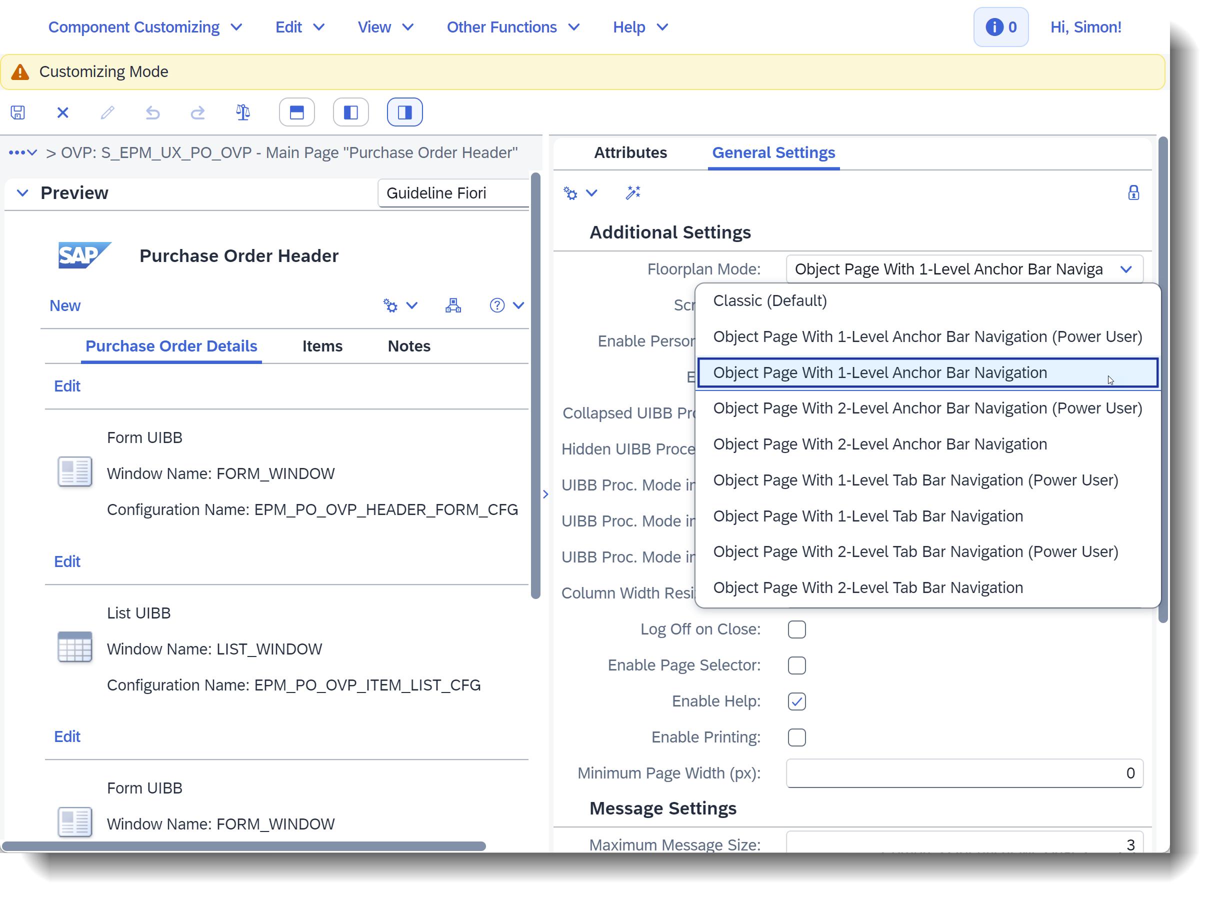
In Figure 1, I have taken demo application S_EPM_FPM_PO and Floorplan Mode OA1 to demonstrate the necessary adaptations, for instance, on the customizing level

Figure 1: Changing the Floorplan Mode of OVP component configuration S_EPM_UX_PO_OVP
In addition, I have added the title Result List on the Initial Page for the List UIBB EPM_PO_OVP_SEARCH_LIST_CFG, see Figure 2. In Floorplan Mode OA1, the respective UIBB titles are displayed above the UIBBs and in the anchor bar.

Figure 2: Adding a title for the result list on the Search Page
Dynamic Page Header
The above adjustments enable the page header areas to automatically collapse or expand as you scroll down or up, as illustrated in Figure 3. Conversely, the header toolbar maintains a fixed position.
 Figure 3: Floorplan Mode OA1 – Search Page of EPM Purchase Order Application showing the expanded and collapsed page header
Navigation Bar
The anchor bar and the tab bar are variants of the navigation bar in the OVP header. They have distinct differences in terms of the UIBBs displayed and navigation functionality. For example, in Floorplan Mode OA1 the anchor bar represents the UIBBs of the current page and the respective UIBB titles are displayed in the anchor bar (see Figure 4), while a tab bar represents the sections of the current page and the section titles are displayed in the tab bar.

Figure 4: Main page of EPM Purchase Order Application showing the new anchor bar of Floorplan Mode OA1
Additional Remarks
Some features of the OVP floorplan may behave differently when rendered in Object Page modes. These differences may impact aspects such as the header, UIBB selector UI control, page master splitter UI control, UIBB height, section column resizing, sections and UIBB stacking, UIBB stacking, panels, drag-and-drop of UIBBs, panels and panel stacks, UIBB collapse/expand, and personalization. However, the Power User Modes allow you to override some of the constraints imposed by Object Page rendering. You can enable drag-and-drop for moving UIBBs, panels, and panel stacks around the UI. You can also expand and collapse UIBBs.
Stay tuned for more insights and updates 😉 Happy coding!
如有侵权请联系:admin#unsafe.sh