
In the 2015 time frame I had come to the conclusion that the curl logo could use modernization and I was toying with ideas of how it could be changed. The original had served us well, but it definitely had a 1990s era feel to it.
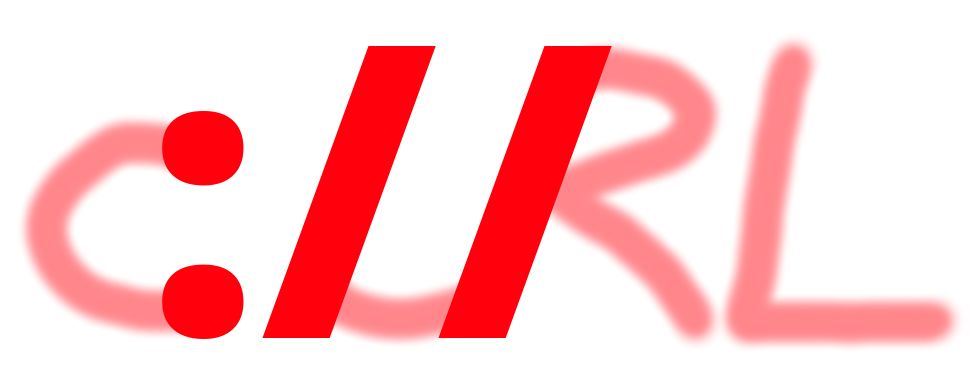
On June 11th 2015, I posted this image in the curl IRC channel as a proof of concept for a new curl logo idea I had: since curl works with URLs and all the URLs curl supports have the colon slash slash separator. Obviously I am not a designer so it was rough. This was back in the day when we still used this logo:

Frank Gevarts had a go at it. He took it further and tried to make something out of the idea. He showed us his tweaked take.

When we met up at the following FOSDEM in the end of January 2016, we sat down together and discussed the logo idea a bit to see if we could make it work somehow. Left from that exercise is this version below. As you can see, basically the same one. It was hard to make it work.

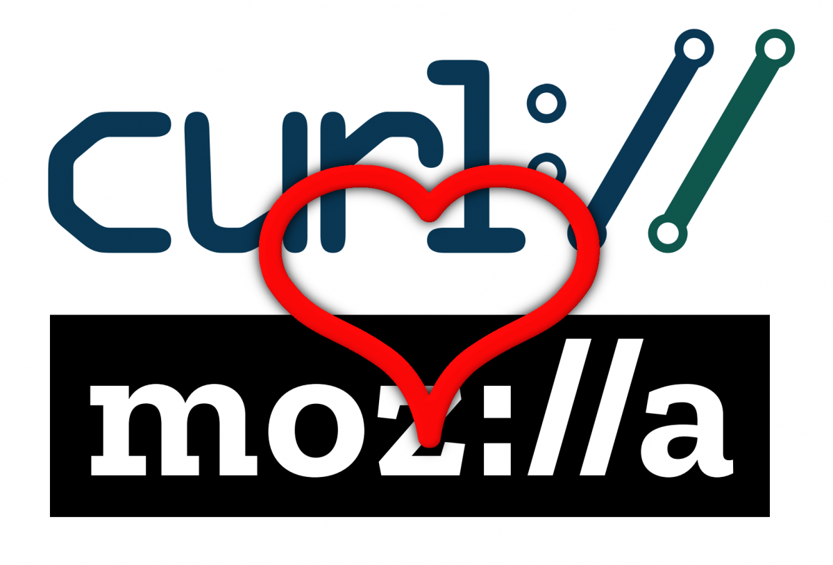
Later that spring, I was contacted by Soft Dreams, a designer company, who offered to help us design a new logo at no cost to us. I showed them some of these rough outlines of the colon slash slash idea and we did a some back-and-forthing to see if we could make something work with it, but we could not figure out a way to get the colon slash slash sequence actually into the word curl in a way that would look good. It just kept on looking different kinds of weird. Eventually we gave that up and we ended up putting it after the word, making it look like curl is a URL scheme. It was ended up much easier and ultimately the better and right choice for us. The new curl logo was made public in May 2016. Made by Adrian Burcea.
Just months later in 2016, Mozilla announced that they were working on a revamp of their logo. They made several different skews and there was a voting process during which they would eventually pick a winner. One of the options used colon slash slash embedded in the name and during the process a number of person highlighted the fact that the curl project just recently changed logo to use the colon slash slash.
In the Mozilla all-hands meeting in Hawaii in December 2016, I was approached by the Mozilla logo design team who asked me if I (we?) would have any issues with them moving forward with the logo version using the colon slash slash.
I had no objections. I think that was the coolest of the new logo options they had and I also thought that it sort of validated our idea of using the symbols in our logo. I was perhaps a bit jealous how Mozilla is a better word to actually integrate the symbol into the name…. the way we tried so hard to do for curl, but had to give up.
In January 2017 Mozilla announce their new logo. With the colon slash slash.
And now you too know how this happened.